Last time, we talked about some different graphs and charts you can use to tell a story with numbers. If you haven’t read that post yet, check that out here! This week, we’ll be going over some examples of each type of graph and chart.
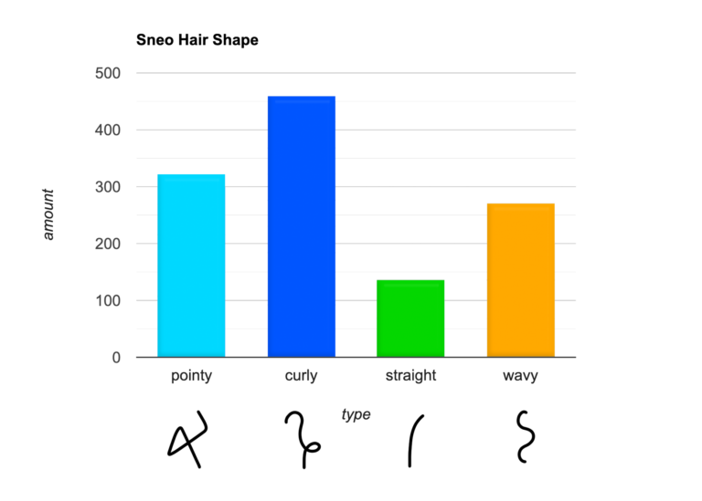
1. Bar Chart – Notice that both axes are labeled clearly. You can also color-code the bars if you like!
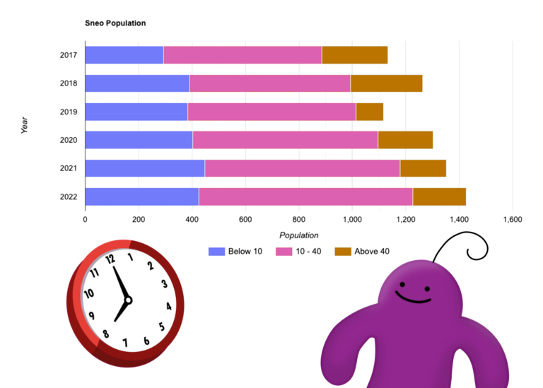
2. Stacked bar chart – Color-coding each section of the bars makes this graph a whole lot easier to read.
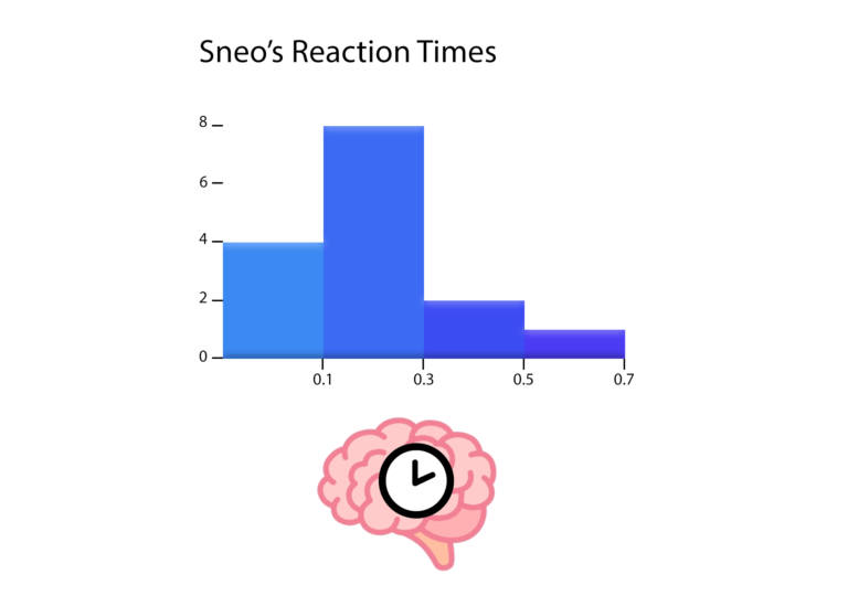
3. Histogram – Notice that histograms measure changes in the value of a single variable over time. In this case, it’s Sneo’s reaction times!
4. Line graph – This is probably the most recognizable type of graph out there. We’ve all seen them!

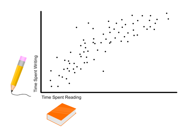
5. Scatter Plot – This graph is really good for showing all the data collected while also highlighting a trend, even with some outliers. Most people in this group who spent a lot of time writing also spend a lot of time reading, but there are a few outliers.
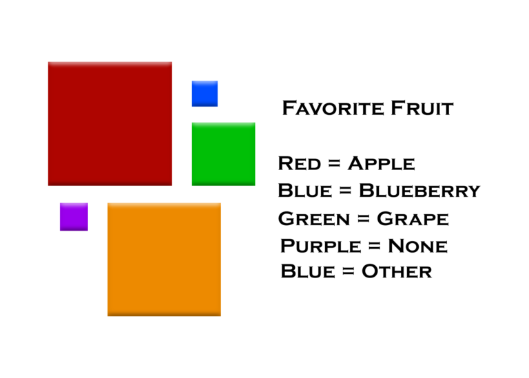
6. Proportional Area Chart – Each square’s area is determined by the amount of corresponding data. For example, you can see here that a lot of people liked apples or other unspecified fruit.
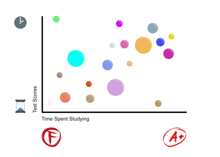
7. Bubble Chart – This cool chart is like a mix between a proportional area chart and a scatter plot.
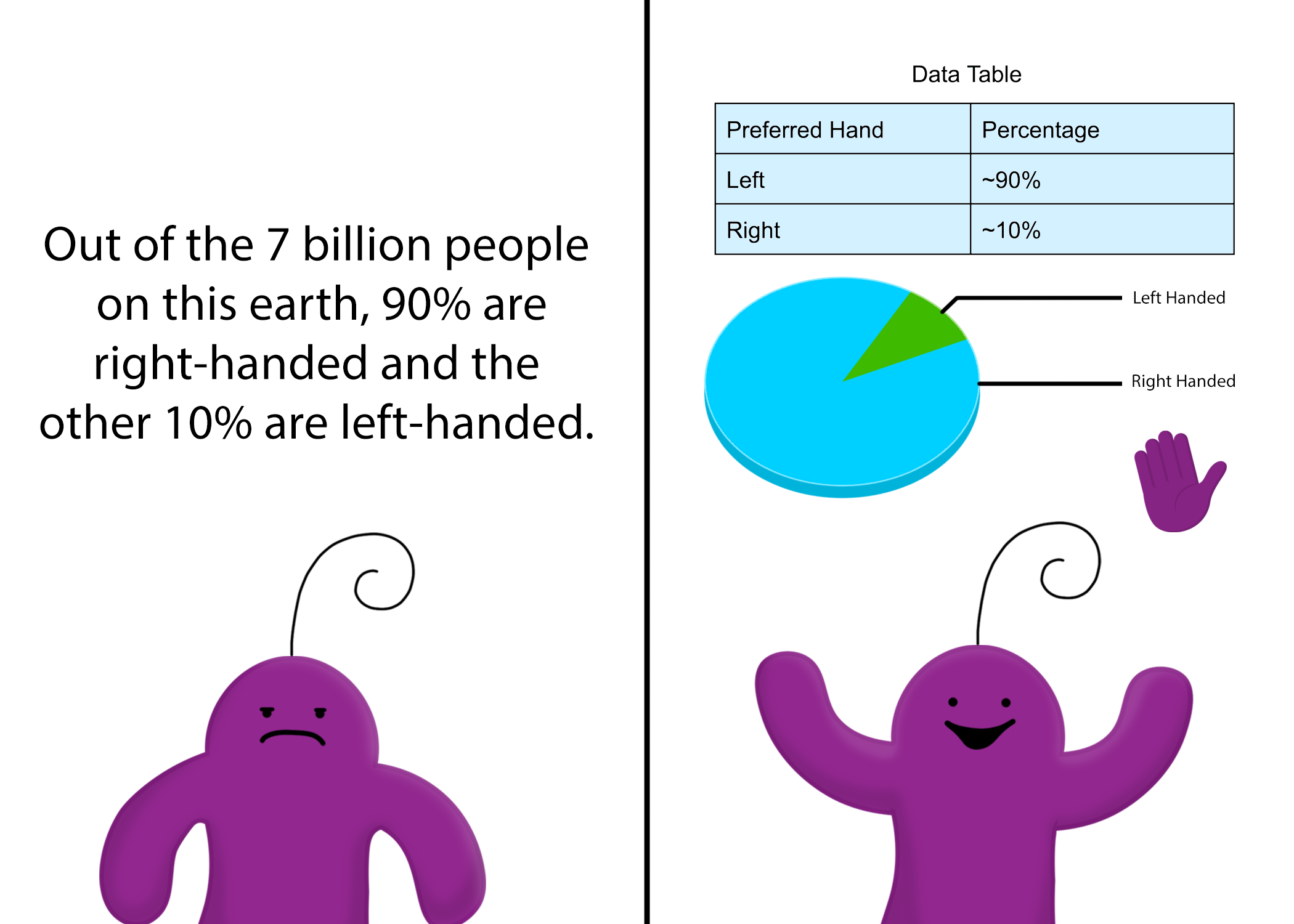
8. Pie Chart – This chart almost looks like a big pie divided into different slices.

9. PIctogram Graphs – This chart can be difficult to read if there’s a lot of information, but it adds a fun touch to an otherwise boring set of numbers!

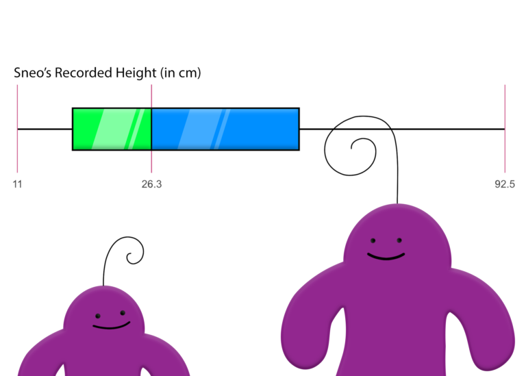
10. Box Plots – This box plot summarizes a lot of important numbers (the minimum, first quartile, median, third quartile, and maximum) in a quick and easy way. As you can tell from this box plot, most Sneos aren’t even a ruler’s length tall…
